
Visual marketing is not about making things look good; it is a cognitive and behavioral system that shapes perception, reduces friction, and increases conversion.
Most brands believe their visuals are “fine.” The logo looks modern. The website looks clean. Social graphics look polished.
Yet performance lags.
Traffic doesn’t convert. Landing pages bounce. Ads underperform.
The problem isn’t effort. It’s a misunderstanding.
Visual marketing is not decoration. It is decision architecture. It shapes how quickly people understand you, how much they trust you, and whether they act.
If you want the straightforward one-point answer:
Visual marketing works when it decreases cognitive load and signals credibility and also guides attention toward action. Everything else is just noise.
What Actually Is Visual Marketing?
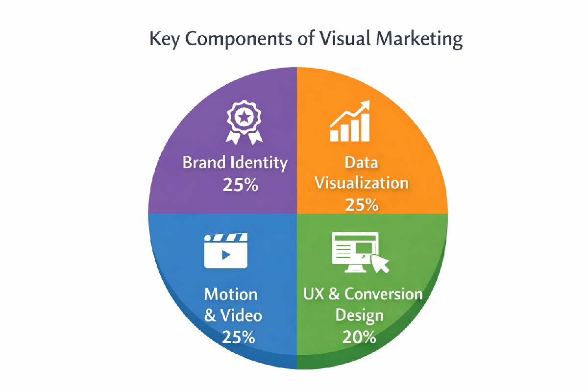
Visual marketing is the purposeful use of design, structure, imagery, motion, and layout to influence behavior and perception across all the brand touchpoints.
This visual marketing includes:
-
Brand identity
-
Landing page hierarchy
- Product packaging
- Social visuals
- Website layout
-
Data visualization
-
App interface design
If someone sees it before making a decision, it is part of visual marketing.
The key distinction:
Visual marketing is strategic. Visual content is tactical.
What is the reason? Visual Marketing Works
1. Processing Speed and Attention
Mostly humans process visuals faster than a text. Here, eye-tracking studies from the Nielsen Norman Group shows all users scan pages in some predictable patterns before reading it deeply.
Your layout communicates before your message does.
If your hierarchy is unclear, your value is unclear.
2. Cognitive Load & Clarity
Daniel Kahneman’s work on System 1 and System 2 thinking shows that humans prefer low-effort processing.
Clutter increases mental friction.
Structure reduces it.
Example scenario:
Landing Page A
-
3 fonts
-
5 colors
-
Dense paragraphs
-
Weak contrast
Landing Page B
-
1–2 fonts
-
Strong headline hierarchy
-
Clear white space
-
Single dominant CTA
Even without better copy, Page B typically feels more trustworthy and easier to act on.
3. Design as a Trust Signal
Stanford Web Credibility Research found that design quality strongly influences perceived credibility.
Users often judge:
-
Professionalism
-
Legitimacy
-
Security
Based on visual cues alone.
Trust is formed visually before it is formed rationally.
Visual Marketing vs Visual Content Marketing
| Criteria | Visual Marketing | Visual Content Marketing |
|---|---|---|
| Scope | Entire brand ecosystem | Individual content assets |
| Goal | Shape perception & conversion | Drive engagement & reach |
| Longevity | Long-term system | Campaign-based |
| Risk | Strategic misalignment | Low engagement |
Posting infographics is content.
Redesigning your checkout experience is visual marketing.
The 4-Step Visual Marketing Framework
Step 1: Define Intended Perception
Ask:
-
Should we feel premium or approachable?
-
Technical or friendly?
-
Minimal or expressive?
Without defined perception, design becomes inconsistent.
Step 2: Audit & Diagnose
Review:
-
Website consistency
-
Social templates
-
Color system
-
Typography alignment
Checklist:
-
Is there one dominant visual language?
-
Are CTAs visually distinct?
-
Is spacing consistent?
Step 3: Simplify & Structure
Remove:
-
Redundant visual elements
-
Competing CTAs
-
Excess decorative graphics
Clarity beats creativity.
Step 4: Align With Conversion
Use:
-
Heatmaps
-
Scroll tracking
-
A/B testing
Here we should link to a deeper CRO guide.
Measure behavioral shifts, not compliments.
Aesthetic-First vs Conversion-First Design
| Criteria | Aesthetic-First | Conversion-First |
|---|---|---|
| Clarity | Often secondary | Primary |
| Emotional Impact | High | Balanced |
| Scalability | Hard to replicate | System-driven |
| Revenue Impact | Unpredictable | Measurable |
The highest-performing brands blend both—but clarity always wins.
Measuring Visual Marketing Performance
Avoid vanity metrics.
Instead measure:
-
Conversion rate changes
-
Scroll depth improvements
-
Heatmap concentration shifts
-
Reduced bounce rate
-
Increased time on page
Example scenario:
After simplifying the layout and increasing CTA contrast, a SaaS homepage sees:
-
Lower bounce rate
-
Higher demo clicks
-
Longer average session time
Not because of better copy—but because of better structure.
Behavioral Flow Graph

Risks, Trade-offs & When Visual Marketing Is Overrated
Visual marketing cannot fix:
-
Poor product-market fit
-
Weak value proposition
-
Bad pricing strategy
Overdesign can:
-
Slow load times
-
Distract attention
-
Inflate costs
In early-stage startups, clarity often matters more than sophistication.
The Future of Visual Marketing
Three forces are reshaping the field:
-
AI tools lower design barriers.
-
Visual saturation increases.
-
AI search extracts structured answers.
This means:
-
Systems beat one-off assets.
-
Structured visuals improve extractability.
-
Intentional hierarchy matters more than artistic flair.
Final Perspective
Visual marketing is leverage.
It reduces friction.
It accelerates trust.
It guides decisions.
When treated as decoration, it’s optional.
When treated as behavioral infrastructure, it becomes a growth driver.